Monday, June 25, 2012

Documenting Analysis Services Cubes with Reporting Services

Documenting cubes in Microsoft Analysis Services 2008 has never been an easy task, and there are a number of commercial software out there that help you with this task. However, you can create an efficient documentation using Microsoft Reporting Services.

The way to do this is to fill in the description fields of measures, dimensions, hierarchies and levels within the Analysis Services project, then use the DMV query language in Reporting Services to query the metadata of the cubes (this is very simple!). Below I describe some pros and cons of this approach, and then proceed to the steps on how to implement this.

Advantages

  • Once you create the layout of the report, you do not need to update it anymore. The report automatically gets a list of measures and dimensions in the cube, so any changes such as new, changed and removed measures or dimensions are immediately reflected.
  • You can use some basic HTML tags such as <b> for bold, <ul> and <li> for lists and <a> for links.
  • Customizeable layout on the Reporting Services side.

Limitations

  • The description field is a plain text box. It becomes uncomfortable with lengthy descriptions, and it is not possible to include images, videos or other multimedia content directly.

How To

  1. Open the Analysis Services project from within Visual Studio and open the cube structure.
  2. Fill in the description fields of Measures, Dimensions, Hierarchies and Levels. There are several places where you can fill in the description. The following can help you:
    • Measures: Click on any measure and then fill in the Description field from the Properties box (if you do not see the Properties, right click and choose Properties).
      Figure 1 - Measures description
    • Dimensions: Similarly, click on the top-level dimension to add their descriptions.
      Figure 2 - Dimensions description
    • Hierarchies, Levels & Dimension Attributes: Open each dimension (.dim) to edit the descriptions of dimension attributes, hierarchies and levels.
      Figure 3 - Hierarchies, levels and dimension attributes description
    • Calculated Measures: For calculated measures, it's a little different. From the cube structure, go to the Calculations tab and hit the Properties button on the toolbar at the top. The description field can be found in this window.
      Figure 4 - Calculates measures description
  3. Once you filled in the description fields and deployed the cube, open the Report Designer from within the Business Intelligence Studio (Note: The following steps can only be made using Report Designer, and not Report Builder 3.0).
  4. Create a new Data Source to your Analysis Services.
    Figure 5 - Creating a data source
  5. Create a new Data Set based on that data source and open the Query Designer. Locate a pick axe icon on the toolbar and click the button to switch to DMX Designer. Then click on the right-most icon to switch from Design Mode to text mode as the screenshots below.
    Figure 6 - Switch to DMX

    Figure 7 - Switch from Design Mode to Text
  6. Here you can enter some DMV queries to retrieve measures and dimensions metadata from a cube. For instance, to get all the measures and their metadata, use the following query (replacing 'Adventure Works' with the name of your cube)
    SELECT * FROM $System.MDSCHEMA_MEASURES WHERE CUBE_NAME = 'Adventure Works'
    This gives you information such as measure caption, unique name, description and group name which you can use to display the documentation.
  7. You need to create new data sets, one for dimensions, one for hierarchies and one for levels. Use the following queries for each:
    • Dimensions: SELECT * FROM $System.MDSCHEMA_DIMENSIONS where CUBE_NAME = 'Adventure Works'
    • Hierarchies: SELECT * FROM $System.MDSCHEMA_HIERARCHIES where CUBE_NAME = 'Adventure Works'
    • Levels: SELECT * FROM $System.MDSCHEMA_LEVELS where CUBE_NAME = 'Adventure Works'
  8. You can then freely build the report and use this data to display the documentation however you want. I built a sample report that you can see in the screenshot below (I only changed a few descriptions for the sample).
    Figure 8 - Sample report with a few descriptions

Additional Notes

There are additional fields that you can make use of, one of which is visibility. Some measures or dimensions may be hidden in the cube. Each data set contains a property to check whether the field is visible or not.

You can also query for cubes, perspectives and other elements of an Analysis Services project. There are some resources available online about DMV queries; look up for cube metadata using DMV queries.

In Report Builder 3.0, for technical reasons, you cannot use DMv queries, therefore you must use the Visual Studio Report Designer.

Tags: documentation cubes analysis services reporting services dmx dmv query metadata measures dimensions description field as2008

Wednesday, March 28, 2012

SSRS: Dynamic zoom for maps in Reporting Services 2008 R2

The maps in reporting services miss one important feature: dynamic zoom. By this, I mean the ability for a user to zoom into the map while looking at the report and panning around to see the locations of interest. This is necessary for instance when you display the world map and wish to zoom into smaller countries or specific areas.

Unfortunately I did not find any ideal solution to this issue, however I will present here a (somewhat) acceptable solution, that allows the user to tweak zoom level while automatically centering on the locations of interest.

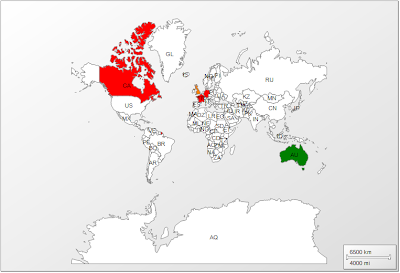
To start, I created a basic report that displays the world map, and visualizes country data from the AdventureWorksDW by color. For simplicity, I removed the legend and color scale, and this is what I have:

Figure 1 - Starting map
The sample includes very few countries but that's okay.

What we will do is allow the user to specify the countries of interest, and the map automatically centers itself between those countries.

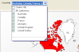
I modify my data set to take a list of countries as a parameter, and then add the list of countries as a report parameter.

Figure 2 - Countries parameter

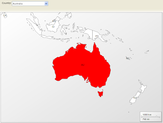
The next step is to enable the automatic-centering between the countries of interest. To show you what I mean, I (for now) manually zoomed into the map and then with the report running, I selected only Australia. Figure 3 shows the result.

Figure 3 - Map automatically centers on Australia
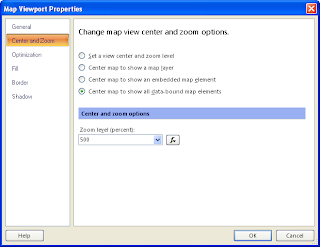
In order to do this, right click on the map (away from the polygons) and choose "Viewport Properties". Go into the "Center and Zoom" tab, and under "Change map view center and zoom options", select "Center map to show all data-bound map elements" as in the screenshot below.

Figure 4 - Center map
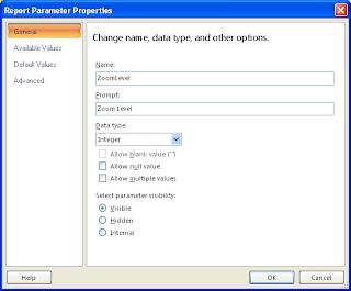
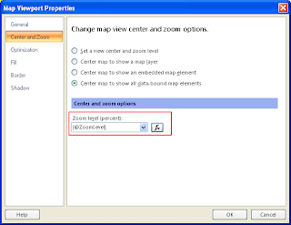
Finally we need the ability to dynamically change the zoom level. This is the not-that-nice part, but it is so far the only possible way I found. In the same window as Figure 4, there is a Zoom level field. What we can do is create a report parameter of type integer (with default of 100) (Figure 5), and then link this zoom field to that parameter using expressions.

Figure 5 - ZoomLevel parameter

I called the parameter ZoomLevel, and now the viewport properties looks like Figure 6.

Figure 6 - Map zoom level from parameter
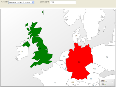
The result is that the users can select countries of interest and then tweak the zoom level as they desire. For instance, I ran the report and chose Germany and United Kingdom as countries, and set the zoom level parameter to 1500, achieving the following result:

Figure 7 - Map centered and zoomed
This solution is still far from the comfort of using the mouse wheel for zooming, and dragging the mouse to pan around. However I have not found any other better way. Some interactivity with the map would be an appreciated feature of Reporting Services.

tags: reporting services report builder 3.0 maps dynamic zoom automatic


Tuesday, February 21, 2012

SSRS: World Maps for Reporting Services

The map visualization tool in Reporting Services 2008 R2 is a great feature that introduces multiple ways of visualizing data on a map. Some of the possibilities are:

  • Coloring countries based on some data
  • Showing bubbles or markers over countries that vary in color, shape or size based on data
  • Marking exact coordinates on the map based on geospatial data
Figure 1 - Example of USA map, where color of states depict sales value and size of circles represents count (or importance) of customers
Unfortunately however, Reporting Services only comes with a USA map and its states. 

Figure 2 - USA maps only
Surely there will be the need for maps of other geographical locations, most importantly the whole world. I would suggest the following 2 places for this:

  1. MapGallery on Codeplex (http://mapgallery.codeplex.com/).
    Besides having the world map, there are also other geographical locations.

    How to use: Maps downloaded from this location are in .RDL format. To be able to use the map from Report Builder/Business Intelligence Development Studio on your workstation, move the file to the MapGallery folder (typically "C:\Program Files\Microsoft Visual Studio 9.0\Common7\IDE\PrivateAssemblies\MapGallery\" for Business Intelligence Development Studio and "C:\Program Files\Microsoft SQL Server\Report Builder 3.0\MapGallery" for Report Builder 3.0). If you have a Report Server and want anyone that loads the Report Builder 3.0 through the ClickOnce, then the map must be in the server, typically in "C:\Program Files\Microsoft SQL Server\MSRS10_50.MSSQLSERVER\ReportingServices\ReportServer\ReportBuilder\RptBuilder_3\MapGallery".

    The map will now be listed in the map gallery (see Figure 2).

    Downside: I found that the world map from this site contains missing geographical locations unfortunately.

  2. World Countries Map from Blue Marble Geographics ( http://www.bluemarblegeo.com/products/worldmapdata.php?op=download)

    How to use: They offer a free shapefile of the world map. Once the archive is downloaded, you can extract it locally or upload the files on the report server using the report manager so anyone can use it. Then when creating a new map, you choose the "ESRI shapefile" (2nd option in Figure 2) and browse to the SHP file.

    This map I have so far found more detailed.

Finally you can visualize data on a world map.

Figure 3 - Some sample data over a world map using AdventureWorksDW
Tip: Country names/codes, continents and states in your data must exactly match with the ones found in the map data. If you are using an RDL file for the map, you can edit the file in WordPad and modify the names to fit your data. For SHP files, you probably need an SHP editor, otherwise you'd have to change your data to fit the map data. From my experience, I found common mismatches such as United States of America and USA, United Arab Emirates and Utd. Arab Emirates, and so on.

Tags: reporting services ssrs report builder maps map gallery esri shapefile import